Skip to main

Paragraphs Demo Page

This is a Standard Page Intro. Add a page intro to pages that need extra messaging, an introduction, strong calls to action, or more visual weight at the very top. All elements are optional (image, heading, paragraph, buttons, links). Choose between standard or "fancy page intro" (full-width photo behind text).

Up to 40 words of paragraph text. The fewer links and buttons presented, the higher their conversion rate will be, so limit to one for best interaction results.

Clouds and stars over a mountain

Fast Facts

A group of numeric facts or stats. Create new fact blocks as needed or select existing ones by title (to make sure they’re consistent when used in multiple places across the site and make them easier to update). Choose an appropriate icon from the list to match what each stat is about.

mapsearchCreated with Sketch.
#1

Demo Fact

globaltravelCreated with Sketch.
Fact 2

Demo

Suitcase_2Created with Sketch.
95%

of facts are made up

buildingCreated with Sketch.
75%

this is a test

globeCreated with Sketch.
25

icons test

Fast Facts with outline icons

this is a test to compare outline styles. 

Asset 53
#1

icon test

Asset 1
#2

icon test

Icon
#3

Icon test

Asset 24
#4

icon test

Asset 1
#5

test icon

Accordion

Text-only panels that users can expand to show content in each section. Avoid using accordions to shorten a page that users would want to read in entirety. Because they present barriers to on-screen reading and require extra clicks, they’re best for when a small section of a page applies to a specific audience but all other audiences could skip over that info.

Tab 1

Text-only panels that users can expand to show content in each section. Avoid using accordions to shorten a page that users would want to read in entirety. Because they present barriers to on-screen reading and require extra clicks, they’re best for when a small section of a page applies to a specific audience but all other audiences could skip over that info.

Tab 2

Text-only panels that users can expand to show content in each section. Avoid using accordions to shorten a page that users would want to read in entirety. Because they present barriers to on-screen reading and require extra clicks, they’re best for when a small section of a page applies to a specific audience but all other audiences could skip over that info.

Tab 3

Text-only panels that users can expand to show content in each section. Avoid using accordions to shorten a page that users would want to read in entirety. Because they present barriers to on-screen reading and require extra clicks, they’re best for when a small section of a page applies to a specific audience but all other audiences could skip over that info.

Alert - Use to communicate urgent items like impending deadlines or recent changes to policy or procedure. Avoid leaving up more than 2-3 weeks — outdated, overused, or always-present alerts can cause banner blindness (where users skip over them without reading) and harm the site’s credibility for when you really need users to see a message.

Optional link

Body

Use the body component for rich text styles of running paragraph text.

Heading styles 2-6 are available in the format drop-down menu. Use headings every 1-2 paragraphs to break up blocks of text.For accessibility compliance, always use heading styles in semantic order (e.g., don't jump from H3 down to H6 just for looks, skipping over H4 and H5).

Embedded image and video media.

Optional caption for embedded media

Bold and Italics are available in the formatting bar, as well as a link builder and inline styles like:

  • Unordered lists (bullets)

  1. Ordered lists (numbers)

Block quotes to set off and indent long quotations.

Tables (for tabular/comparative data only). Avoid using just for formatting purposes, as these can present accessibility problems to some users and internet browsers.

Table caption. Describe what's in it to make it more accessible to screen reading software.
Column 1 Column 2
Data 1 Data 2
Data 3 Data 4

Connect With Us

Body with video embeds

Ipsum aliqua cupidatat et ad mollit et irure. Commodo incididunt deserunt do esse mollit nulla ad elit laborum qui. Irure excepteur officia est enim quis exercitation dolore elit sit esse esse. Ipsum aliqua cupidatat et ad mollit et irure. Commodo incididunt deserunt do esse mollit nulla ad elit laborum qui. Irure excepteur officia est enim quis exercitation dolore elit sit esse esse.

Full content, no float

Ipsum aliqua cupidatat et ad mollit et irure. Commodo incididunt deserunt do esse mollit nulla ad elit laborum qui. Irure excepteur officia est enim quis exercitation dolore elit sit esse esse. Ipsum aliqua cupidatat et ad mollit et irure. Commodo incididunt deserunt do esse mollit nulla ad elit laborum qui. Irure excepteur officia est enim quis exercitation dolore elit sit esse esse.

Partial content, right float

Ipsum aliqua cupidatat et ad mollit et irure. Commodo incididunt deserunt do esse mollit nulla ad elit laborum qui. Irure excepteur officia est enim quis exercitation dolore elit sit esse esse. Ipsum aliqua cupidatat et ad mollit et irure. Commodo incididunt deserunt do esse mollit nulla ad elit laborum qui. Irure excepteur officia est enim quis exercitation dolore elit sit esse esse.

Body with Inset - Alert

This is a body text component with an inset region that allows you to select a sub-paragraph to nest inside your body text. You can use the configuration settings menu under the gear icon to choose whether you want the inset item to appear on the right or the left of your body text. (Default puts the inset item to the right.)

Available options for inset paragraphs include:

  • Alert
  • Call to Action
  • Fast Facts
  • Inset Callout
  • Link Lists
  • Media
  • Teaser (a reference to existing content)
  • Testimonial

This is an Alert paragraph set into the inset region of the Body with Inset paragraph. 

Alert Link

Body with Inset - Call to Action

This is a body text component with an inset region that allows you to select a sub-paragraph to nest inside your body text. You can use the configuration settings menu under the gear icon to choose whether you want the inset item to appear on the right or the left of your body text. (Default puts the inset item to the right.)

Available options for inset paragraphs include:

  • Alert
  • Call to Action
  • Fast Facts
  • Inset Callout
  • Link Lists
  • Media
  • Teaser (a reference to existing content)
  • Testimonial

Call to Action Paragraph

Body with Inset - Fast Fact

This is a body text component with an inset region that allows you to select a sub-paragraph to nest inside your body text. You can use the configuration settings menu under the gear icon to choose whether you want the inset item to appear on the right or the left of your body text. (Default puts the inset item to the right.)

Available options for inset paragraphs include:

  • Alert
  • Call to Action
  • Fast Facts
  • Inset Callout
  • Link Lists
  • Media
  • Teaser (a reference to existing content)
  • Testimonial
YourPlace_Icon
Fast Fact paragraph

Nested inside a Body with Inset paragraph

Body with Inset - Inset Callout (flipped left)

This is a body text component with an inset region that allows you to select a sub-paragraph to nest inside your body text. You can use the configuration settings menu under the gear icon to choose whether you want the inset item to appear on the right or the left of your body text. (Default puts the inset item to the right.)

Available options for inset paragraphs include:

  • Alert
  • Call to Action
  • Fast Facts
  • Inset Callout
  • Link Lists
  • Media
  • Teaser (a reference to existing content)
  • Testimonial

This is an Inset Callout paragraph set into the inset region of the Body with Inset paragraph. 

Optional Link

This is a body text component with an inset region that allows you to select a sub-paragraph to nest inside your body text. You can use the configuration settings menu under the gear icon to choose whether you want the inset item to appear on the right or the left of your body text. (Default puts the inset item to the right.)

Available options for inset paragraphs include:

  • Alert
  • Call to Action
  • Fast Facts
  • Inset Callout
  • Link Lists
  • Media
  • Teaser (a reference to existing content)
  • Testimonial

Body with Inset - Media

This is a body text component with an inset region that allows you to select a sub-paragraph to nest inside your body text. You can use the configuration settings menu under the gear icon to choose whether you want the inset item to appear on the right or the left of your body text. (Default puts the inset item to the right.)

Available options for inset paragraphs include:

  • Alert
  • Call to Action
  • Fast Facts
  • Inset Callout
  • Link Lists
  • Media
  • Teaser (a reference to existing content)
  • Testimonial
Clouds and stars over a mountain

Optional caption for the media.

Body with Inset - Teaser

This is a body text component with an inset region that allows you to select a sub-paragraph to nest inside your body text. You can use the configuration settings menu under the gear icon to choose whether you want the inset item to appear on the right or the left of your body text. (Default puts the inset item to the right.)

Available options for inset paragraphs include:

  • Alert
  • Call to Action
  • Fast Facts
  • Inset Callout
  • Link Lists
  • Media
  • Teaser (a reference to existing content)
  • Testimonial

Body with Inset - Testimonial

This is a body text component with an inset region that allows you to select a sub-paragraph to nest inside your body text. You can use the configuration settings menu under the gear icon to choose whether you want the inset item to appear on the right or the left of your body text. (Default puts the inset item to the right.)

Available options for inset paragraphs include:

  • Alert
  • Call to Action
  • Fast Facts
  • Inset Callout
  • Link Lists
  • Media
  • Teaser (a reference to existing content)
  • Testimonial

Contact / Location

Contact name or department

Job title or short description

Phone: (555) 555-5555

Office: Optional office address

Location

A stylized panel for displaying formatted contact information for a person or office. All fields are optional.

Custom Teasers, Stacked (Default)

Small chunks of content that represent a preview (or “teaser”) of the items they’re linking to.

Clouds and stars over a mountain

Demo Teaser 1

Headlines act as the links, so write them with some keywords from the target page so users understand what they’ll be taken to on click.  

Morgan Collinson, petting a golden retriever

Demo Teaser 2

Create new teasers as needed or select existing ones by title (to make sure they’re consistent when used in multiple places across the site and make them easier to update). 

Custom Teasers, Grid Option

To display teasers side-by-side instead of stacked, choose "Is Grid" from the configuration options menu under the gear icon.

Demo Teaser 3

Description text and images are optional, but teasers in the same set should always match.

Demo Teaser 4

Use similar text lengths between teasers so items will line up side-by-side.

Clouds and stars over a mountain

Default Style Options Feature, 50/50 on light background

A one-item promotional panel that combines a headline, up to about 50 words of text, optional link, and media (image or video). These can be more editorial than teasers, because their links are separate from their headlines.

Create new features as needed or select existing ones by title (to make sure they’re consistent when used in multiple places across the site and make them easier to update).

Clouds and stars over a mountain

Configured Style Options Feature, 50/50 with green accent

  • Fifty-fifty gray accent

  • Fifty-fifty green accent

  • Fifty-fifty yellow accent

  • Fifty-fifty dark background

  • Full image background

  • Full

Clouds and stars over a mountain

Configured Style Options Feature, 50/50 with yellow accent

For fifty-fifty styles, default puts media left and text right, or you can flip them with the “Flip” checkbox under the configuration options. 

Style variants available under the configuration options include:

  • Fifty-fifty gray accent

  • Fifty-fifty green accent

  • Fifty-fifty yellow accent

  • Fifty-fifty dark background

  • Full image background

  • Full 

mcDaniel College graduating seniors class of 2019

Feature - Content Reference (news content type) Senior profiles: A glimpse of the Class of 2019 Custom super/subhead just for this page (everything else pulls from the source content node)

Image List

A version of described list with images, e.g. for displaying a custom list of committee members or scholarship winners with short descriptions of text in an accessible table-like format.

Clouds and stars over a mountain

List Item 1

Use this style when you need short chunks of text (with or without a title link) paired with images in rows, similar to how they would look if you put them into a table in an MS Word document. Tables are difficult to render properly in responsive web designs where the layout changes to suit any screen size, and they can cause problems for accessibility, so this component is specially designed to give you the same layout functions with some additional resizing and formatting code to control the pieces better on smaller, vertical screens.

Clouds and stars over a mountain

List Item 2

Use this style when you need short chunks of text (with or without a title link) paired with images in rows, similar to how they would look if you put them into a table in an MS Word document. Tables are difficult to render properly in responsive web designs where the layout changes to suit any screen size, and they can cause problems for accessibility, so this component is specially designed to give you the same layout functions with some additional resizing and formatting code to control the pieces better on smaller, vertical screens.

Important Dates

Aug 21

Deadline, Event, or Other Important Date #1

Aug 23

Deadline, Event, or Other Important Date #2

A set of columned link groups, for when you have lots of links to display at once and it’s helpful to break them into categories, e.g., for an audience gateway page for parents, current students, or faculty. 

Choose an appropriate icon from the list to match what each stat is about.

Superhead Logo Grid

A grid of images with special sizing settings just for logos, so they won’t be subjected to the same responsive cropping settings that apply to regular images on the site. Use sparingly for things like accreditation or partnership logos that are required. For regular images, use the Media Gallery or Carousel components instead.

Media

Clouds and stars over a mountain

An image or video with optional caption that displays across the width of the page column. 

Rollover Blocks

A group of cards/blocks with a background image, title, paragraph text, and optional link. Create new blocks as needed or select existing ones by title (to make sure they’re consistent when used in multiple places across the site and make them easier to update). 

Body with Inline Heading

This option should disappear when "has sidebar" is checked.

On full-width pages without a sidebar, use this option (including a heading) instead of regular Body to keep optimal line lengths for screen reading. WYSIWYG controls are the same as the regular Body paragraph.

Optional Superhead for the Group Double Feature Optional Subhead for the Group

Clouds and stars over a mountain

Optional Superhead for Feature 1 Demo Feature 1 Optional Subhead for Feature 1

Same elements as a regular Feature paragraph, but displayed 2-up on wide screens. 

Use similar text lengths between features so items will line up side-by-side.

Morgan Collinson, petting a golden retriever

Optional Superhead for Feature 2 Demo Feature 2 Optional Subhead for Feature 2

Create new features as needed or select existing ones by title (to make sure they’re consistent when used in multiple places across the site and make them easier to update). 

Double Feature - Content References Uses "Reference Feature" and "Add New" to add new reference to other content to this page

Renie Tsomos at Interviewing Day

Interviewing Day at McDaniel: Jobs, internships and career contacts

The first floor of Lewis Recitation Hall was electric with excitement, anticipation and nerves as the clock ticked off the final minutes before the 3 p.m. start of Interviewing Day 2018.

Mathematics major Angel Tuong '19

Angel Tuong, Class of 2019

Angel Tuong '19 traveled all the way from Ho Chi Minh in Vietnam to study Mathematics, Economics and French at McDaniel. She describes her Math Problem Seminar as the best class ever, where she "gained skills to solve math and real life problems like patience, logical reasoning and a lot more patience."
Clouds and stars over a mountain

Configured Style Options Feature, 50/50 on dark background

For fifty-fifty styles, default puts media left and text right, or you can flip them with the “Flip” checkbox under the configuration options. 

Style variants available under the configuration options include:

  • Fifty-fifty gray accent

  • Fifty-fifty green accent

  • Fifty-fifty yellow accent

  • Fifty-fifty dark background

  • Full image background

  • Full 

Clouds and stars over a mountain

Feature, 50/50 on gray background

Clouds and stars over a mountain

Configured Style Options Feature, Full-width with Image Background Full-width Pages Only (No Sidebar)

Style variants available under the configuration options include:

  • Fifty-fifty gray accent

  • Fifty-fifty green accent

  • Fifty-fifty yellow accent

  • Fifty-fifty dark background

  • Full image background

  • Full 

Full Feature, full width with no image

Feature paragraphs can go next to a sidebar column or at the bottom in a full-width page region, but some variants look better in one or the other. You can change which variant it uses by adjusting the configuration options under the gear icon in the edit form.

Variants that are recommended at full width only include:

  • Dark background (purple)
  • Gray background
  • Full-width with background image
  • Full-widh with no background image

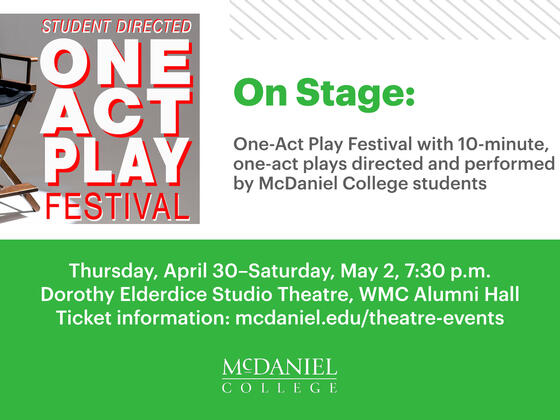
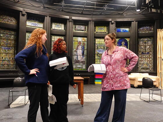
Recent News for Theatre Arts

Six ROTC cadets commissioned as Army officers - Tyler John Ambrose, Noah C. Conner, Rebecca Lynn Olsen, Michael Elliott Orr, Michael Duvall Rigoli and Kyle Franklin Shaffer

Superhead Mini Program Finder

The mini version of the program finder tool (as shown in the design comps on the Home and Academics pages) is available to administrators as a paragraph choice on the Page content type. 

Superhead Routing Cards

Blocks of links to route users between choices. Headlines act as the links, so write them with some keywords from the target page so users understand what they’ll be taken to on click. Description is optional, but blocks should have similar text lengths so they’ll line up side-by-side.

#6

Testimonial Default Style

Lorem ipsum dolor sit amet, consectetur adipiscing elit, sed do eiusmod tempor incididunt ut labore et dolore magna aliqua. Ut enim ad minim veniam, quis nostrud exercitation ullamco laboris nisi ut aliquip ex ea commodo consequat.

Example with Attribution

"Is Yellow" Testimonial without Attribution

Lorem ipsum dolor sit amet, consectetur adipiscing elit, sed do eiusmod tempor incididunt ut labore et dolore magna aliqua. Ut enim ad minim veniam, quis nostrud exercitation ullamco laboris nisi ut aliquip ex ea commodo consequat.

Outline Testimonial with image offset (image optional)

Multiple testimonials in grid display. Default display is green, select "Is Yellow" for style variant

Lorem ipsum dolor sit amet, consectetur adipiscing elit, sed do eiusmod tempor incididunt ut labore et dolore magna aliqua. Ut enim ad minim veniam, quis nostrud exercitation ullamco laboris nisi ut aliquip ex ea commodo consequat.

Lorem ipsum dolor sit amet, consectetur adipiscing elit, sed do eiusmod tempor incididunt ut labore et dolore magna aliqua. Ut enim ad minim veniam, quis nostrud exercitation ullamco laboris nisi ut aliquip ex ea commodo consequat.

Lorem ipsum dolor sit amet, consectetur adipiscing elit, sed do eiusmod tempor incididunt ut labore et dolore magna aliqua. Ut enim ad minim veniam, quis nostrud exercitation ullamco laboris nisi ut aliquip ex ea commodo consequat.

Connect With Us